Saturday, June 13, 2009

Proposition 13: Who Benefits anymore?

A lot has been written about California's Proposition 13 over the years, with many people crediting it for reducing homeowner property taxes (irrespective of the destruction it wrought on the state's public school system). As housing values increased, Prop 13 limited re-assessment to 2% per year, which did hold down assessment values and the resulting property tax payments.

But with the massive drops in property values over the last few years, most California homes are actually taxed at their actual values. This chart shows the maximum possible assessed value of a median California home based on the year it was purchased (in brown) and the actual assessed value (in blue). For the most part, only home purchased before 1988 are assessed below their real value:


This obviously varies from city-to-city, but in many places in the state - particularly any subdivision built after 1980 - no homeowner benefits from Proposition 13 anymore.

This chart shows the annual financial benefit for a median home based on the year of purchase:


This is clearly very skewed towards older homeowners. Housing prices are expected to remain flat for the foreseeable future, so by 2012 or 2013, only a very small proportion of homes purchased in the last 30 years would receive any benefit from Proposition 13.

So why bother even having the law on the books? As with Rent Control laws, it made sense to insulate homeowners from the rapid increase in property taxes that occurred as housing prices were bid up irrationally from 1999-2006. But there isn't really a good reason for assessing homes below market value in the long run.

Changing the maximum annual re-assessment from 2% to 5% would bring most assessments in the state in line with their real values while giving taxpayers a decade to adjust to the new law. And if we required the legislation to be revenue-neutral, then the maximum property tax payment could be reduced from 1% of assessed value to 0.9% or 0.8%. Proposition 13 has resulted in a massive wealth transfer from the young to the old; it's time it went the other way.
Historical Tax Rates

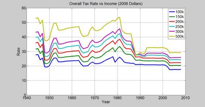
A lot has been made of President Obama's tax increases for couples making over $250,000 a year. Both sides of the debate have engaged in hyperbole - the pro-tax side pointing to the 94% tax rate in the early 1960s as evidence that taxes are at an historical low (without mentioning that nobody paid that top rate); and the anti-tax side claiming that slight increases in taxes on the top 1% of incomes create powerful disincentives to work. But what would this hypothetical couple's taxes have been historically? How different are tax rates today than they used to be? I haven't seen this data, so I had to put it together myself:


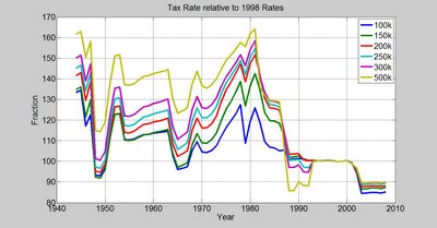
For most people, aside from the period of "bracket creep" in the 1970s, tax rates have fallen in a very small band since 1954. Taxes are presently at their lowest levels for all groups (aside from the $500k+ earners, who hit their low in 1988-89 and then saw rates go up in the "Read My Lips" era.) One important thing to keep in mind is that because of increasing inequality, earning an inflation-adjusted $500k was much less common in the past than it is today.

This graph shows tax rates as a percentage of their 1998 levels:

Past Recessions

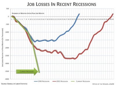
This graph from House Speaker Nancy Pelosi's blog got a lot of press over the last few days:


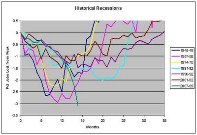
That situation looks pretty dire. Of course, the data they used to generate the chart is available back to 1945, and they didn't include recessions prior to 1990 - for various reasons. Adding previous downturns muddies the picture a bit:


Economic downturns have taken various forms over the years and the explanation for the recovery in each case probably isn't as clear as it was in 1991 or 2003. But what's clear is that we've entered the most severe recession most of us have seen in our lives. Not only that, the three months since the Presidential Election have been a disastrous period of inaction.

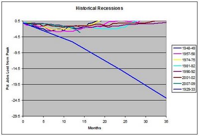
But compare that to what happened during the depression:


If job losses in this recession exceed 10% of the labor force, the economic situation will be a disaster beyond anything most of us would have imagined. It boggles my mind to think of what the impact of losing 24% of the jobs in the United States would be.

2008 Holiday Spending

We've been hearing terrible things about retail sales since October, and they've reached a frenzy during the holiday shopping season. One item in the San Francisco Chronicle today caught my eye:

"[holiday] retail sales were down 2 to 4 percent compared with last year...this holiday season...will probably go down as one of the worst in decades."

Of course the data was buried in the middle of the article, while the "bad news" was in the second sentence.

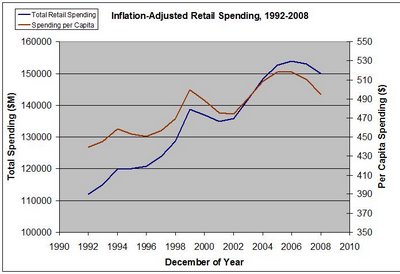
So what's the real story? This chart shows total and per capita retail sales in the United States, adjusted for inflation. I assumed a 3% drop in gross receipts from 2007 to 2008.


That's hardly the worst season in decades - even after the media has badgered us for months about declining consumer confidence and reduced spending, per capita spending is still at the same level it was in December 1999, when consumer confidence was at an all-time high.

The "Monkey Pollster" vs fivethirtyeight.com

There's a lot that went into fivethirtyeight.com's state-level polling analysis. But I wondered if a very basic approach to poll aggregation would perform just as well - in much the same way that the simple Marcel "Monkey" baseball predictions perform just as well as the more advanced projection systems.

The "Monkey Pollster" simply averages the last five polls before the election; if there were fewer polls, it uses only them; if there were multiple polls on the same day and it's only possible to determine what the last five polls were, they all get used. Here's how the "Monkey pollster" did compared to fivethirtyeight.com:

R^2 of actual Obama margin of victory vs model:

538 - 0.9704; Monkey - 0.9686

[Uses line of best fit with non-zero constant...]

Mean-Squared Error:

538 - 35.7; Monkey - 28.3

Electoral Votes: (365 Actual)

538 - 353; Monkey - 338.

Both systems missed Indiana, and the Monkey prediction was 0.7% low for North Carolina, while fivethirtyeight was 0.7% high - in the right direction. Overall, the Monkey performed just as well as the more sophisticated system.

Let me be clear that this is in no way an indictment of the work that appeared on fivethirtyeight.com. I think it was brilliant to incorporate Monte Carlo analysis into the presidential election - but we can also see that a complex poll-weighting system may be no better at rejecting outlying data than a simple averaging, even of bad polls.